The Colors of Spring
 Each fall, Pantone releases their top 10 colors for the coming spring based on the color trends at New York Fashion Week. Now that spring is in full swing, take a look at the top colors of the season!
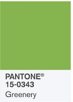
Greenery (Pantone 15-0343) - Pantone's 2017 Color of the Year is a lush green taken straight from nature.
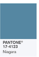
 Niagara (Pantone 17-4123) - The name evokes thoughts of water, which is perfect for this blue shade.
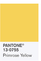
Primrose Yellow (Pantone 13-0755) - A warm, bright hue reminiscent of a sunny day.
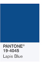
Lapis Blue (Pantone 19-4045) - While blue is always a popular color, this shade is a richer, darker color than the first blue in the list.

 Flame (Pantone 17-1462) - A bright, fiery orange that is perfect for warmer seasons.
Island Paradise (Pantone 14-4620) - Another blue on the list, but this one is a lighter shade reminiscent of the sky on a sunny spring day.
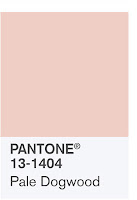
Pale Dogwood (Pantone 13-1404) - This light pink shade reminds us of Rose Quartz, one of Pantone's 2016 Colors of the Year.
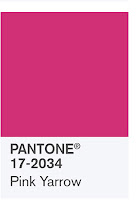
Pink Yarrow (Pantone 17-2034) - Named after a hue of the yarrow flower, this is a bright bold color.
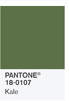
Kale (Pantone 18-0107) - This green shade is named after the leafy green vegetable that the color resembles.
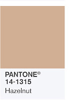
 Hazelnut (Pantone 14-1315) - One of the few neutral shades on this list, Hazelnut is a toned down, light brown/tan shade.
Do any of Pantone's top spring colors go with your branding? Which is your favorite color for spring?
Labels: Color, colors, DBP Chicago, Design, graphics, marketing, Pantone, PMS Colors, spring, spring colors
